UA-20248021-6
Showing posts with label print of original. Show all posts

Sunday, July 13, 2014

Beach Child Holding Red Ball Seashore Watercolor Painting

https://www.etsy.com/listing/196109345/beach-boy-red-ball-seashore-art-painting?
 
 
It looks like I just can't get enough of this adorable little boy! I saw him on the beach with his father and grandfather and, of course, asked if I could photograph him for some new paintings. No problem! Although the pictures that I took showed only sand as a backdrop, I wanted to create a beautiful sunny day with waves and clouds.
 
Colorful shadows are always important to me in creating an interesting painting; after all, this is art and not a photograph! I used the mingling technique of letting one color delicately run into the next, careful not to get mud!
 
My painting is of a child clutching his big red ball enjoying the day with his family. He seems to be in his own happy world of perfect peace, soaking up the sunshine, surf, and warm sand!
 
I created this watercolor for all of you who enjoy family beach vacations. For me it brings back warm memories of my now-grown children, for you it might remind you your own children or even grandchildren playing on the beach! Enjoy!
 

Monday, June 2, 2014

Beach Adirondack Chairs...And the Winner is...

https://www.etsy.com/listing/176111955/beach-adirondack-chair-art-print?
 

Thanks to all of you who entered my Mother's Day Contest! You shared wonderful memories of your moms, based on my paintings that reminded you of her. ...And the Winner is Lou Anne P! Congratulations! The prize is a $52 gift certificate from my shop for a large matted 16x20 fine art print of her choice.
 
"We didn't sit on the beach but in the back yard almost every summer evening chatting, laughing, telling stories, playing. My mom and whomever had time to enjoy the moment would choose a spot from her eclectic, colorful supply of outdoor furniture. These precious evenings continued her whole life and I often ponder the memories today as I sit in my own colorful eclectic supply of furnishings on the patio."  Lou Anne

Linked to Watercolors by Barbara Etsy Shop, Watercolors By Barbara Website, Fine Art America, Make it Pretty Monday, IShouldBeMoppingTheFloorBoogieboardCottage, Alphabe-Thursday, Join the Party {Linky}  Fall into Fall, and Pink Saturday, Five Days Five Ways, Friday Favs, Fancy These Friday’s, Friday Link Party, Saturday Show & Tell, The DIY'ers, Anything Blue & Pink Friday

Friday, October 25, 2013

Monarch Butterfly Painting Art Print of Original Watercolor

https://www.etsy.com/listing/166839979/monarch-butterfly-painting-art-print-of?
© 2013 Barbara Rosenzweig, Watercolor Painting
11x14 matted to 16x20 $52
8x10 matted to 11x14 $37
sold matted for standard size frames 
 
It seems that I just can't get enough of painting this fabulous butterfly! I'm lucky to have the Asclepias plant in my garden. It's a milkweed that the Monarch loves and I, too, love it for its bright yellow and orange colors. You can see that I like to fade out the flowers to better feature the butterfly. I chose this "pose" to paint because its wings were partly closed showing the beautiful markings there.
 
Here's my other Monarch Butterfly painting with the wings open. Do you have a preference? It seems that there were fewer Monarchs around this summer. Have you seen that difference, too?
 
https://www.etsy.com/listing/154764254/monarch-butterfly-art-print-reproduction?
© 2013 Barbara Rosenzweig, Watercolor Painting
11x14 matted to 16x20 $52
8x10 matted to 11x14 $37
sold matted for standard size frames 


Tuesday, October 8, 2013

Grey Horse Portrait Painting Watercolor Art

© 2013 Barbara Rosenzweig, Watercolor Painting
11x14 matted to 16x20 $52
8x10 matted to 11x14 $37
sold matted for standard size frames
  
I don't know if you remember a TV show called "Mr. Ed (1961-66)," but I do! I was thinking of it while painting this horse portrait and the thought of it kept bringing a smile to my face, especially as I painted its eyes. I almost felt as though it was coming alive and was ready to speak to me, like it did on TV!
What were your memories of this show?


Wednesday, August 28, 2013

Boy Child Play in Park Painting - Finished!

 
© 2013 Barbara Rosenzweig, Watercolor Painting
11x14 matted to 16x20 $52
8x10 matted to 11x14 $37
sold matted for standard size frames
 
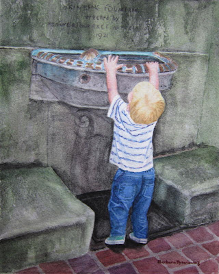
I just love painting children! After chasing this fast-moving tyke all over historic Philadelphia's Rittenhouse Square Park, I finally stopped and found him on his tippy-toes trying to reach into the water fountain!

In my earlier posts, you saw the process and techniques of laying out all of the parts of the painting. This is the most challenging and time-consuming part -bringing the painting to life!


My first task was to add layer upon layer of greens and hematite black (a granulating watercolor paint that is perfect for stone) to all of the stone work. This creates depth and a sense of age.
 
Next, I had to create the copper trim around the water fountain with its lovely turquoise patina. I used some unlikely colors - maroon, purple, burnt sienna, blue, and yellow, until they gave me the result that I was looking for. I had to be careful to leave the white of the paper showing where the light hit the copper.
 
Then on to the little boy! Here, you can see that I lightened the crown of the head to bring out his white blond hair in the sun. Around the back of his uplifted head, I darkened the hair where it would be in shadow.
For the shirt, I added thin, short lines of purple into the stripes to give it more punch. Also, adding pale blue and purple in the shadows in the folds made the shirt look like it was twisted on his body.
 
For the jeans, I used a variety of blues, as well as purple, to build up the color, darkening in the folds and lifting the color where the light hit the tops of the folds. To "lift" color, I use a slightly moistened thin brush, gently stroking the area where I want the color removed. The I use a clean paper towel to blot the spot. I used this technique for the stitching around the pockets and the seams.
 
 
Next, I needed to correct the right foot. It looked like it was flat on the ground, but the heel should be lifting. I changed the angle of the heel, shortened the toe, and darkened the shadow below it closest to the heel. As you read this, you can see from the photo above if any of these changes improved the painting.
 
Now for a decision. When I saw the little boy at the fountain, he had a ball in his right hand. Although I did start to paint it, I felt that it didn't add anything to the painting. I decided instead to make his hand grasp onto the rim of the water fountain appearing as though he was really trying to pull himself up.
 
Now for the final step! Once the wall above the fountain was sufficiently mossy and "aged," I added the lettering that appeared there, "Drinking Fountain erected by Flower Market Association 1921."
 
I hope that you enjoyed and learned about the many decisions, techniques, and choices that I make throughout this process. Painting for me is both a challenge and a joy!
 

© 2013 Barbara Rosenzweig, Watercolor Painting
11x14 matted to 16x20 $52
8x10 matted to 11x14 $37
sold matted for standard size frames


Size
 

Linked to Watercolors by Barbara Etsy Shop, Watercolors By Barbara Website, Fine Art America, IShouldBeMoppingTheFloorBoogieboardCottage, Alphabe-Thursday, Join the Party {Linky}  Fall into Fall, and Pink Saturday, Five Days Five Ways, Friday Flair Linky Party, Friday Favs, Fancy These Friday’s, Friday Link Party, Saturday Show & Tell, The DIY'ers

Tuesday, August 6, 2013

Bicycle Racer Bike Rider Painting

 
"Bicycle Racer"
© 2013 Barbara Rosenzweig, Watercolor Painting
11x14 matted to 16x20 $52
8x10 matted to 11x14 $37
sold matted for standard size frames
 
I love to change it up and challenge myself. For this new painting in my Sports Series, I chose a bike rider. I knew that it would be difficult figuring out how to arrange the legs, with the arms overlapping, as well as getting the color combinations right. This first attempt (below) was a disaster! I didn't like how the colors were mingling and the perspective was wrong. After working on it for a couple of days, I decided that it would be better to start over.
 
 
Starting over was really helpful. With watercolors, unlike oils, it is difficult to rework and dramatically change the colors. Oils are opaque and you can cover dark with light colors easily. Here, the color can stain the paper and once the light colors are covered with darker ones, it is really hard to go back to light. Here, I've corrected the perspective by widening the wheels. I then mingled different color combinations. To do this, I used one color, quickly cleaned my brush, and then touched a new color to the edge of the first watching them do their magic! I continued this throughout the painting. Below, I found that the legs looked confusing and I didn't like the red under the green arm.
 
 
Finally, I made a lot of progress. Because the shadow under the front wheel was too light, I added a touch of red under it and blended it into the rest of the shadow. This made the wheel appear to rest on the ground a bit more. Next, I worked on the legs, correcting the colors. In order to remove the red, I carefully lifted it with a slightly wet brush, stroking and removing as much as possible. Next came the handlebars and gears, trying to stay with the plan of mingling the colors, but allowing for the necessity to show which body part was behind and in front of the bike parts. This process took a long time, but I wanted to give you some highlights into my challenges and thought processes as I created this painting. I'd love to hear any of your comments or suggestions!
© 2013 Barbara Rosenzweig, Watercolor Painting
11x14 matted to 16x20 $52
8x10 matted to 11x14 $37
sold matted for standard size frames 


Size
Linked to Watercolors by Barbara Etsy Shop, Watercolors By Barbara Website, Fine Art America, Alphabe-Thursday, Fall into Fall, and Pink Saturday, Five Days Five Ways, Friday Flair Linky Party, Friday Favs, Fancy These Friday’s, Friday Link Party, Saturday Show & Tell   

Saturday, July 27, 2013

Blue White Vase Oranges Watercolor Painting


 © 2013 Barbara Rosenzweig, Watercolor Painting
11x14 matted to 16x20 $52
8x10 matted to 11x14 $37
sold matted for standard size frames
I chose to create a still life painting because I thought that I needed another challenge. I know, I'm crazy! I had never painted oranges or anything reflected in a mirror! In order to decide what the values (lights and darks) were for this painting, I started with the darkest tone, the background. Many watercolorists go from light to dark, but for this particular painting, I decided to do it in reverse. Using a flat brush, I was able to get more concentrated color and less water on my brush. I also wicked off the excess water onto a paper towel. Using a hatch-work of blues and purples, I built up layers of color creating a sense of depth for the background.
Once the background was in, I could then determine how dark to make the floral design on the vase. I wanted to use a variety of blues, from very dark indigo to a lighter ultramarine, adding purple to increase interest and depth. I also used a masking fluid, somewhat like the rubber cement I used to use as a child, that protects the white area of the paper. The gray lines on the oranges and vase will allow me to paint over those areas and not stain the paper. When the painting is almost done, I can peel off the hardened masking fluid revealing the white paper below it.

Next, I built up layers of orange and yellows to create the colors of the fruit.


After completing the floral design on the vase (below), I could see that the color looked dark and muddy on the top left flower and that I needed to work on the oranges after I removed the masking fluid. Too many lines, blotchy patches on the reflected orange needed a lot of work.

After lightening and reworking the flowers and toning down the stripey look of the oranges (below), I felt that I was finally on the right track. I added a very pale orange color showing the reflection back onto the vase from the orange in front of it. I wanted to keep it subtle. Still, it needed more drama.

To give it more pizazz, I used titanium white and white casein paint to create the reflections on the vase and to "moisten" the look of the oranges. I also put more blue on each side of the vase to help create the illusion that it is round. Pale blue on the table's surface makes it look more reflective.

 © 2013 Barbara Rosenzweig, Watercolor Painting
11x14 matted to 16x20 $52
8x10 matted to 11x14 $37
sold matted for standard size frames
My goal was to make the Chinoiserie blue and white Ming vase with orange segments both elegant and striking. I hope that this post has helped you understand my decision-making process and that you enjoyed the old-world charm of this painting. Did I reach my goal? 

Size

 
 Linked to Watercolors by Barbara Etsy Shop, Watercolors By Barbara Website, Fine Art America, Alphabe-Thursday, Fall into Fall, and Pink Saturday, Anything Friday , Pretty Monday

Wednesday, April 24, 2013

Yellow Hibiscus Flower Art Print of Original Watercolor Painting

 
This tropical flower is absolutely stunning! I love painting all of the wonderful crinkles, textures, neat structures, and shadows of this hibiscus!
 
For this painting I used the technique called "mingling." To paint the shadows, I used one color after the other, but rinsed the brush before using the next color. This way, I let the new color just touch the preceding one, allowing the color to mingle in lovely and unexpected ways. That's part of the fun of watercolors!
 
Check out this unique technique for painting the shadows and tell me what you think!
 
Linked to Watercolors by Barbara Etsy Shop, Watercolors By Barbara Website, Fine Art America, Blue Monday, Alphabe-Thursday, Fall into Fall, and Pink Saturday   

Tuesday, April 16, 2013

Brown Pelican Seashore Bird Wildlife Painting

 
I just love watching this fabulous bird! It gracefully glides over the water, dives to catch a fish, then perches contentedly to digest its meal.
 
What a challenge to paint it, too! This time, I wanted to make the plumage realistic, but not show each feather. The light is important, showing the shadows without hiding the details is a bit tricky!
 
I hope that you enjoy this portrait of the Brown Pelican and will find the perfect spot in your home for it! Isn't he majestic?!


Saturday, March 16, 2013

Pink Flamingos Bird Painting

 
These exotic, tropical flamingos are both soothing and colorful. I loved painting their interesting heads and beaks used for sifting for food in the sand. They almost look comical!
 

Friday, February 8, 2013

Passion Flower Watercolor Painting


This exotic tropical flower is absolutely sensational! The passion flower's intricate structures are exquisite, as well as its colors. This fine art reproduction of my original watercolor painting is fabulous as a focal point for your home decor.

Linked to Watercolors by Barbara Etsy Shop, Watercolors By Barbara Website, Fine Art America, Alphabe-Thursday, Fall into Fall, and Pink Saturday 

Wednesday, February 6, 2013

Beach Boy Walking - Watercolor Painting


Even in chilly weather, walking on the beach is an adventure! This little boy is striking out on his own looking for whatever treasures wash up on the shore. I just couldn't resist capturing this moment! I loved painting the waves with the dancing foam on the water and his reflection on the wet sand.
 
Enjoy this fine art reporduction of my original watercolor painting in your child's room or added to your vacation home decor.
 

Friday, January 4, 2013

Beach Girl & Red Shovel - New Watercolor Painting


Deep in concentration, this little girl is intent on creating the perfect sand castle, ignoring all around her, even the crashing nearby waves! This fine art print of my original watercolor painting will bring back memories of family beach vacations and brighten up your child's room. It's also perfect for your vaction home decor.

Linked to Watercolors by Barbara Etsy Shop, Watercolors By Barbara Website, Fine Art America, Alphabe-Thursday, Fall into Fall, and Pink Saturday 

Sunday, December 9, 2012

CONE SEASHELL - New Watercolor Painting

Who would think that a deadly sea snail would live in a beautiful shell like this! I can't get over the beauty and variety of Nature and can't stop painting it, too!

I've been collecting shells since I was a little girl. Actually, come to think of it, I'm still a little girl, especially since I've lost three inches over the past few years! Those early experiences never left me. I went on collecting seashells and became a science teacher focusing on biology and a watercolor artist, which both are expressions of joy in the natural world.

Do you collect seashells? You just never know where it will lead you and enrich your life!

by Barbara Rosenzweig


Thursday, November 1, 2012

NEW PAINTING "Garden Tools with Sun Hat"


I love the creative process of gardening. Both my mother and grandmother were gardeners who inspired me. The tools in this painting are theirs and I love the beauty of the rust. This art print of my original watercolor would make a marvelous addition to your sun room or the perfect gift for the gardener in your life!

I thought that you would like to see how I create my watercolor paintings. After starting with a photograph of the still life on my kitchen table that captures the light at that moment, I begin to paint. The green ribbon on my hat blended too much with the greens in the background, so I changed it to red. Decision time begins when I have to plan what type of surface I want my leather gardening glove, rusty gardening tools, and straw sun hat to rest on. At first, I have to admit that I was timid. I wanted it to be a wooden bench, but was not real adventuresome about the colors of the wood. Finally, as you can see in the finished painting at the top, I threw away all inhibitions!


Not quite done. Check the top finished photo to see the refinements.
 
I'd love to hear your reactions to my latest watercolor painting!


Sunday, October 7, 2012

WHITE WATER LILY - New Watercolor Painting

When I think of fabulous flowers, the water lily instantly comes to mind! I've taken hundreds of photos of them over the years, but this is the first time that I have attempted to paint one. I guess that before this time I felt that I needed more experience to try it.

There are a lot of challenges here. Besides figuring out how to paint essentially white petals, giving them a sense of depth and interest, I had to understand how to paint a reflection in water. Even though I liked how the reflection petals looked in the middle painting, there was no sense of movement in the water. To give this sensation, I pulled the color from the water across the flower reflection. Also, I wanted to "push back" the lily pad behind the flower and make the blossom "pop." To create this effect, I darkened and added blues and browns for interest and depth. I hope that I achieved these goals in the final painting.

Below are a few of the stages in the creation of this painting.


by Barbara Rosenzweig
 
I hope that you enjoy this new watercolor painting and can see why I made the changes I did. 'Love to hear your comments!


Friday, November 25, 2011

BLACK FRIDAY CYBER MONDAY SPECIAL FREE OFFER 16X20 FINE ART REPRODUCTION


BIGGEST SALE OF THE YEAR - Offer Good until Tuesday, November 29!

YOUR CHOICE of any of my 11x14 Fine Art Reproductions in16x20 white mats- BUY 2 GET 1 FREE - ALL THREE 16x20's for $96.

Choose from my wide variety of Fine Art Reproductions like Beach, Flowers, Landscapes, Still Life, and Abstracts paintings. These are all acid free, archival prints of my original watercolor paintings.

ALL ORDERS to US and CANADA have FREE SHIPPING through Tuesday, November 29th!

CONTACT me with your selections, so that I can set up your VERY SPECIAL CUSTOM RESERVE LISTING.

Inquire for International Shipping Rates.

HAPPY HOLIDAYS!!

Linked to Fabulous Friday