+of+Blue+&+White+Vase+Oranges.jpg)
© 2013 Barbara Rosenzweig,
Watercolor Painting
11x14 matted
to 16x20 $52
8x10 matted to 11x14 $37
sold matted for standard size frames
8x10 matted to 11x14 $37
sold matted for standard size frames
I chose to create a still life painting because I thought that I needed another challenge. I know, I'm crazy! I had never painted oranges or anything reflected in a mirror! In order to decide what the values (lights and darks) were for this painting, I started with the darkest tone, the background. Many watercolorists go from light to dark, but for this particular painting, I decided to do it in reverse. Using a flat brush, I was able to get more concentrated color and less water on my brush. I also wicked off the excess water onto a paper towel. Using a hatch-work of blues and purples, I built up layers of color creating a sense of depth for the background.
Once the background was in, I could then determine how dark to make the floral design on the vase. I wanted to use a variety of blues, from very dark indigo to a lighter ultramarine, adding purple to increase interest and depth. I also used a masking fluid, somewhat like the rubber cement I used to use as a child, that protects the white area of the paper. The gray lines on the oranges and vase will allow me to paint over those areas and not stain the paper. When the painting is almost done, I can peel off the hardened masking fluid revealing the white paper below it.
Next, I built up layers of orange and yellows to create the colors of the fruit.
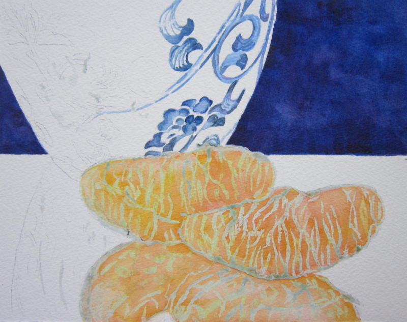
After completing the floral design on the vase (below), I could see that the color looked dark and muddy on the top left flower and that I needed to work on the oranges after I removed the masking fluid. Too many lines, blotchy patches on the reflected orange needed a lot of work.

After lightening and reworking the flowers and toning down the stripey look of the oranges (below), I felt that I was finally on the right track. I added a very pale orange color showing the reflection back onto the vase from the orange in front of it. I wanted to keep it subtle. Still, it needed more drama.

To give it more pizazz, I used titanium white and white casein paint to create the reflections on the vase and to "moisten" the look of the oranges. I also put more blue on each side of the vase to help create the illusion that it is round. Pale blue on the table's surface makes it look more reflective.

© 2013 Barbara Rosenzweig,
Watercolor Painting
11x14 matted
to 16x20 $52
8x10 matted to 11x14 $37
sold matted for standard size frames
8x10 matted to 11x14 $37
sold matted for standard size frames
My goal was to make the Chinoiserie blue and white Ming vase with orange segments both elegant and striking. I hope that this post has helped you understand my decision-making process and that you enjoyed the old-world charm of this painting. Did I reach my goal?
Gorgeous use of color and I love your sense of Oriental composition here! The textures on the orange slices is perfect- slick and shiny!
ReplyDeleteGreat color combination and lovely watercolor.
ReplyDeleteThe way you did these oranges is just wonderful!
ReplyDeleteThis is quite a jewel of a post!
Such a lovely, lovely work of art!
A+
Oh my goodness! It is gorgeous! I love the vase, the oranges and their reflections! Wow!
ReplyDeleteDid you have a vase to view or was the design on the vase all your own?
Love this!
Blessings & Aloha!
Jumping for Joy! I am finally catching up to some of my "J" visits! Please come by if you have a chance.
It's absolutely beautiful! You are one of the features today at the Anything Blue Friday party at The Dedicated House. Pop on in and grab a feature button for your blog. Here is the link to this week's party. http://thededicatedhouse.blogspot.com/2013/08/anything-blue-friday-week-22.html Hope to see you again at the blue soiree. Toodles, Kathryn @TheDedicatedHouse
ReplyDeleteSo beautiful! The oranges are so striking against the blue. Great use of both colors.
ReplyDeleteThis is beautiful. I admire your talent.
ReplyDelete