UA-20248021-6

Tuesday, August 20, 2013

Child Watercolor Painting Process "Boy Reaching" - Continued

CAUTION !!!
You are about to see a painting in its adolescent stage! Beware! You will be seeing the good, the bad, and the ugly! View at your own risk! Hope that you enjoy seeing this daunting process.


Once I decided on the portion of the photo that would be most effective for this painting, I lightly sketched in the important details. Now I take the plunge and put paintbrush to paper.
 
I started by lightly painting in the background and the boy to get a sense of the colors I would be using. Next, I started on the tile floor. Here, I used richer colors that will eventually be toned down.
 
 
Still in the preliminary process, I start to refine the hair, shirt, pants, and sneakers, as well as lay in some turquoise for the beginning of the copper patina on the drinking fountain.


Here's where it starts getting UGLY! I'm laying in colors for the stone wall with its green algae.

 
As you might have guessed by now, I am very slow and deliberate in my painting process. It takes me a long time to complete a watercolor to my satisfaction. At this point, I am nowhere near being done. Once all of the colors are "in," the refining begins. There must be "dark darks" and very "light lights" to make the painting have depth. Once these "values" are established, I can attend to the most difficult and time-consuming part, adding all of the minute details.
 
Can't wait to hear from you!


Thursday, August 15, 2013

New Adventure Watercolor Painting Process "Boy Reaching"

Thanks so much for sending in photos! I can still accept a few more for this New Adventure Series.
As promised, I am using photos that were sent in to create a series of special childhood memories. The photo should show your child or grandchild looking away from the camera and into the new place they've found to play in and explore.
My end of the bargain is to share the entire process with you! There is absolutely NO obligation to buy.
Here is the first of the photos. As you can see, the little boy is absolutely adorable! Even though he is too short to take a drink from the fountain, he has fun reaching up into it!
Once I saw the potential for a painting in this series, I cropped the photo to make it a more interesting composition and focus on the child.


The next step is to start a drawing that includes all of the essential details. As you can see, the lines are very light, so that they don't show through the transparent watercolors too much.
 
 
I look forward to sharing the next stages in this process with you! If you have any questions at all about this process, I'd love to answer them.


Monday, August 12, 2013

Child Boy Girl Portrait Painting - New Adventure Watercolor Series

 
  "Boy into the Surf"       
 
                                             "Girl into the Surf"                                                          


Be part of my NEW ADVENTURE SERIES!

I invite you to send in photos of your child starting out on a Great Adventure! I will create 10 original 8x10 watercolor paintings of the first 10 "favorite photos" I receive with this theme. You will get to follow the progress of the paintings on this blog. My commission rate for that size is usually $225, but for my Blog Buddies, it will be $190 + shipping. No one is obligated to purchase. If you’d like to send in pictures,, post a Comment, so that I can let you know where to send the snapshots. These photos should show your child looking away from the camera and into the new place they’ve found to play in and explore. Above and below are the first New Adventure paintings in my series.

I look forward to seeing all of your imaginative photos!


Tuesday, August 6, 2013

Bicycle Racer Bike Rider Painting

 
"Bicycle Racer"
© 2013 Barbara Rosenzweig, Watercolor Painting
11x14 matted to 16x20 $52
8x10 matted to 11x14 $37
sold matted for standard size frames
 
I love to change it up and challenge myself. For this new painting in my Sports Series, I chose a bike rider. I knew that it would be difficult figuring out how to arrange the legs, with the arms overlapping, as well as getting the color combinations right. This first attempt (below) was a disaster! I didn't like how the colors were mingling and the perspective was wrong. After working on it for a couple of days, I decided that it would be better to start over.
 
 
Starting over was really helpful. With watercolors, unlike oils, it is difficult to rework and dramatically change the colors. Oils are opaque and you can cover dark with light colors easily. Here, the color can stain the paper and once the light colors are covered with darker ones, it is really hard to go back to light. Here, I've corrected the perspective by widening the wheels. I then mingled different color combinations. To do this, I used one color, quickly cleaned my brush, and then touched a new color to the edge of the first watching them do their magic! I continued this throughout the painting. Below, I found that the legs looked confusing and I didn't like the red under the green arm.
 
 
Finally, I made a lot of progress. Because the shadow under the front wheel was too light, I added a touch of red under it and blended it into the rest of the shadow. This made the wheel appear to rest on the ground a bit more. Next, I worked on the legs, correcting the colors. In order to remove the red, I carefully lifted it with a slightly wet brush, stroking and removing as much as possible. Next came the handlebars and gears, trying to stay with the plan of mingling the colors, but allowing for the necessity to show which body part was behind and in front of the bike parts. This process took a long time, but I wanted to give you some highlights into my challenges and thought processes as I created this painting. I'd love to hear any of your comments or suggestions!
© 2013 Barbara Rosenzweig, Watercolor Painting
11x14 matted to 16x20 $52
8x10 matted to 11x14 $37
sold matted for standard size frames 


Size
Linked to Watercolors by Barbara Etsy Shop, Watercolors By Barbara Website, Fine Art America, Alphabe-Thursday, Fall into Fall, and Pink Saturday, Five Days Five Ways, Friday Flair Linky Party, Friday Favs, Fancy These Friday’s, Friday Link Party, Saturday Show & Tell   

Saturday, July 27, 2013

Blue White Vase Oranges Watercolor Painting


 © 2013 Barbara Rosenzweig, Watercolor Painting
11x14 matted to 16x20 $52
8x10 matted to 11x14 $37
sold matted for standard size frames
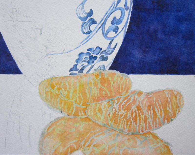
I chose to create a still life painting because I thought that I needed another challenge. I know, I'm crazy! I had never painted oranges or anything reflected in a mirror! In order to decide what the values (lights and darks) were for this painting, I started with the darkest tone, the background. Many watercolorists go from light to dark, but for this particular painting, I decided to do it in reverse. Using a flat brush, I was able to get more concentrated color and less water on my brush. I also wicked off the excess water onto a paper towel. Using a hatch-work of blues and purples, I built up layers of color creating a sense of depth for the background.
Once the background was in, I could then determine how dark to make the floral design on the vase. I wanted to use a variety of blues, from very dark indigo to a lighter ultramarine, adding purple to increase interest and depth. I also used a masking fluid, somewhat like the rubber cement I used to use as a child, that protects the white area of the paper. The gray lines on the oranges and vase will allow me to paint over those areas and not stain the paper. When the painting is almost done, I can peel off the hardened masking fluid revealing the white paper below it.

Next, I built up layers of orange and yellows to create the colors of the fruit.


After completing the floral design on the vase (below), I could see that the color looked dark and muddy on the top left flower and that I needed to work on the oranges after I removed the masking fluid. Too many lines, blotchy patches on the reflected orange needed a lot of work.

After lightening and reworking the flowers and toning down the stripey look of the oranges (below), I felt that I was finally on the right track. I added a very pale orange color showing the reflection back onto the vase from the orange in front of it. I wanted to keep it subtle. Still, it needed more drama.

To give it more pizazz, I used titanium white and white casein paint to create the reflections on the vase and to "moisten" the look of the oranges. I also put more blue on each side of the vase to help create the illusion that it is round. Pale blue on the table's surface makes it look more reflective.

 © 2013 Barbara Rosenzweig, Watercolor Painting
11x14 matted to 16x20 $52
8x10 matted to 11x14 $37
sold matted for standard size frames
My goal was to make the Chinoiserie blue and white Ming vase with orange segments both elegant and striking. I hope that this post has helped you understand my decision-making process and that you enjoyed the old-world charm of this painting. Did I reach my goal? 

Size

 
 Linked to Watercolors by Barbara Etsy Shop, Watercolors By Barbara Website, Fine Art America, Alphabe-Thursday, Fall into Fall, and Pink Saturday, Anything Friday , Pretty Monday

Wednesday, July 17, 2013

Beach Girl Friends Seashore Painting


What could be better than girls having fun together at the beach, especially if they are best friends, sisters, twins! Here, they are delightedly looking at the seagulls, toes tickled by the foamy surf! 

This watercolor painting turned out to be an accidental commission. When I was at an Art Fair, I spotted absolutely adorable twins. I asked their mother if I could take a photo of her children. I was so brazen about asking because I love to paint kids! She agreed and I told her that I would send her an email of the finished painting. ...and the end of the story is that she loved it, wanted the original, as well as matted fine art prints for other family members!

When I looked at the photo, I decided to set the scene at the powder white sands and emerald waters of a Florida beach. It's so much fun to let your imagination soar and not stick to the reality of a photo!


I started with a sketch of the twins, but moved them apart. Next came the sky and beginnings of the water, surf, hair and skin.


Adding waves, refining clouds, deepening the color of the water, putting in the shadows of the blouses came next.


When I started to paint the skirt stripes, I decided that the original colors in the photo were too close to the colors in the water. I wanted drama and fun! I started with pale purple and a hot pink, but felt that deep purple and bright red would work better. The wave on the back right was really starting to bother me. I think that I mostly paint from my gut, not my head. But I just couldn't let go of the fact that I hated that wave, even if I could balance it with others on the left side of the painting. I tried to stop thinking about that wave by adding the three seagulls that the girls were looking at.


 'Couldn't stand it anymore. Out went that wave! I felt much better and then worked on making the emerald waters darker at the horizon to give it depth, refining the hair and skin color, correcting the left leg of the right girl, adding the purple hair clip, deepening the colors of the stripes, darkening the shadows of the clothing, and creating the children's reflections. Done!

I spent so much time on this painting, that I have come to love those little girls. As you might have guessed, I have no grandchildren yet! I had a hard time parting with it, but knew that the family would cherish it. I do have 15 fine art prints that I've made and one will be framed for my home!

I hope that you've enjoyed "listening in" on the decisions I made during my creative process. I'd love to hear from you!!


Size


 Linked to Watercolors by Barbara Etsy Shop, Watercolors By Barbara Website, Fine Art America, Alphabe-Thursday, Fall into Fall, and Pink Saturday   

Friday, July 5, 2013

Monarch Butterfly Art Print of Original Watercolor Painting


I have been away from my blog for way too long. Painting, gardening, travel, family fun - so much to do, so little time! Has that ever happened to you? I've saved a lot for you and will have to catch up fast!

I absolutely love watching the colorful butterflies in my summer garden flit from flower to flower! In this painting, a Monarch butterfly rests momentarily on the Blood Flower Scarlet Milkweed, (Asclepias, if you want to get technical!). It's one of this butterfly's favorites! As with most of my paintings, this one is inspired by the many flowers and creatures in my garden. 

This is the first butterfly I've ever painted and I'm wondering what you think of it. I hope to hear from you soon!

Linked to:
Butterflies and Moths of North America
Butterfly Corner  links to butterflies of the continents of the world 
Butterfly Workx,  a commercial butterfly farm-- species information links and identification guides
Butterfly Rescue International
The Butterfly WebSite  with links to blogs, articles, and more
North American Butterfly Association