© 2013 Barbara
Rosenzweig, Watercolor Painting
11x14
matted to 16x20 $52
8x10
matted to 11x14 $37
sold
matted for standard size frames
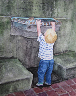
I just love painting children! After chasing this fast-moving tyke all over historic Philadelphia's Rittenhouse Square Park, I finally stopped and found him on his tippy-toes trying to reach into the water fountain!
In my earlier posts, you saw the process and techniques of laying out all of the parts of the painting. This is the most challenging and time-consuming part -bringing the painting to life!
My first task was to add layer upon layer of greens and hematite black (a granulating watercolor paint that is perfect for stone) to all of the stone work. This creates depth and a sense of age.
Next, I had to create the copper trim around the water fountain with its lovely turquoise patina. I used some unlikely colors - maroon, purple, burnt sienna, blue, and yellow, until they gave me the result that I was looking for. I had to be careful to leave the white of the paper showing where the light hit the copper.
Then on to the little boy! Here, you can see that I lightened the crown of the head to bring out his white blond hair in the sun. Around the back of his uplifted head, I darkened the hair where it would be in shadow.
For the shirt, I added thin, short lines of purple into the stripes to give it more punch. Also, adding pale blue and purple in the shadows in the folds made the shirt look like it was twisted on his body.
For the jeans, I used a variety of blues, as well as purple, to build up the color, darkening in the folds and lifting the color where the light hit the tops of the folds. To "lift" color, I use a slightly moistened thin brush, gently stroking the area where I want the color removed. The I use a clean paper towel to blot the spot. I used this technique for the stitching around the pockets and the seams.
Next, I needed to correct the right foot. It looked like it was flat on the ground, but the heel should be lifting. I changed the angle of the heel, shortened the toe, and darkened the shadow below it closest to the heel. As you read this, you can see from the photo above if any of these changes improved the painting.
Now for a decision. When I saw the little boy at the fountain, he had a ball in his right hand. Although I did start to paint it, I felt that it didn't add anything to the painting. I decided instead to make his hand grasp onto the rim of the water fountain appearing as though he was really trying to pull himself up.
Now for the final step! Once the wall above the fountain was sufficiently mossy and "aged," I added the lettering that appeared there, "Drinking Fountain erected by Flower Market Association 1921."
I hope that you enjoyed and learned about the many decisions, techniques, and choices that I make throughout this process. Painting for me is both a challenge and a joy!
© 2013 Barbara Rosenzweig, Watercolor Painting
11x14 matted to 16x20 $52
8x10 matted to 11x14 $37
sold matted for standard size frames
Linked
to Watercolors by Barbara Etsy Shop, Watercolors By Barbara Website, Fine Art America, IShouldBeMoppingTheFloor, BoogieboardCottage, Alphabe-Thursday, Join the Party {Linky} Fall into Fall, and Pink
Saturday, Five Days Five
Ways, Friday Flair Linky Party, Friday Favs, Fancy These Friday’s, Friday Link Party, Saturday Show &
Tell, The DIY'ers