UA-20248021-6

Wednesday, October 16, 2013

White Hibiscus Flower Watercolor Painting

© 2013 Barbara Rosenzweig, Watercolor Painting
11x14 matted to 16x20 $52
8x10 matted to 11x14 $37
sold matted for standard size frames 
 
I had so much fun making the many shadows on my "Yellow Hibiscus" watercolor painting (http://barbararosenzweig.blogspot.com/2013/04/yellow-hibiscus-flower-art-print-of.html), that I knew one day I would paint a white hibiscus! That "day" has come (it actually took quite a long time to create this) and you can check out the results for yourself.
 
As you can see, the brilliant shadows really stand out against the white petals. I love vibrant, rich color! To create this "Mingling" effect, place the first color at one corner of the shadow and, while it is still wet, quickly clean your brush, load with another color, and lightly touch the edge of the brush to the previous color. Then watch the magic begin as the paints blend to form wonderful patterns! Continue this process until the shadow is complete and use this method wherever the mingling works best for the painting.
 
I became so fascinated with this process and its wonderful results, that I created an entire series of painting using ONLY the Mingling technique. You can see this in my experimental Sports Series. https://www.etsy.com/shop/BarbaraRosenzweig?section_id=11890447 
 
Even if you don't consider yourself an artist, grab a children's watercolor set or get one at the dollar store, and just have fun trying this out!


Tuesday, October 8, 2013

Grey Horse Portrait Painting Watercolor Art

© 2013 Barbara Rosenzweig, Watercolor Painting
11x14 matted to 16x20 $52
8x10 matted to 11x14 $37
sold matted for standard size frames
  
I don't know if you remember a TV show called "Mr. Ed (1961-66)," but I do! I was thinking of it while painting this horse portrait and the thought of it kept bringing a smile to my face, especially as I painted its eyes. I almost felt as though it was coming alive and was ready to speak to me, like it did on TV!
What were your memories of this show?


Thursday, October 3, 2013

Tropical Beach Paradise Tiki Resort Painting

© 2013 Barbara Rosenzweig
Original Watercolor Painting
8x10 $190

I have to say, I love being at the shore! I can't seem to get enough of it - whether it's walking the beach, watching children play there, listening to the sound of the relentless surf, observing the wildlife, being mesmerized by fantastic sunsets, or feeling a wonderful sense of calm descend on me every time I'm there.
 
This latest beach painting is of a little Tiki bar located right on the beach. I was fascinated by the wonderful silhouette shapes created by the palm thatching of the Tiki umbrellas, the chair rungs, and the rocks. My goal, which I know is unattainable, was to capture the feel and look of the glowing sun as it was about to set.
 
What are your favorite beach memories?


Friday, September 20, 2013

Ice Hockey Sports Athlete Painting


© 2013 Barbara Rosenzweig, Watercolor Painting
11x14 matted to 16x20 $52
8x10 matted to 11x14 $37
sold matted for standard size frames 
 

Ice Hockey has always been a fast-paced sport that I really enjoyed! I tried to capture the motion, strength, and competitive nature of this athlete. Here, like in the others in my Sports Series, I used my mingling technique to create a unique portrait of  this sportsman.

Linked to Watercolors by Barbara Etsy Shop, Watercolors By Barbara Website, Fine Art America, IShouldBeMoppingTheFloorBoogieboardCottage, Alphabe-Thursday, Join the Party {Linky}  Fall into Fall, and Pink Saturday, Five Days Five Ways, Friday Favs, Fancy These Friday’s, Friday Link Party, Saturday Show & Tell, The DIY'ers

Wednesday, August 28, 2013

Boy Child Play in Park Painting - Finished!

 
© 2013 Barbara Rosenzweig, Watercolor Painting
11x14 matted to 16x20 $52
8x10 matted to 11x14 $37
sold matted for standard size frames
 
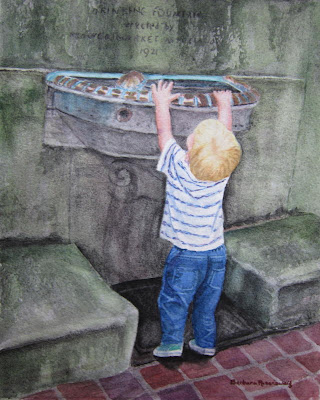
I just love painting children! After chasing this fast-moving tyke all over historic Philadelphia's Rittenhouse Square Park, I finally stopped and found him on his tippy-toes trying to reach into the water fountain!

In my earlier posts, you saw the process and techniques of laying out all of the parts of the painting. This is the most challenging and time-consuming part -bringing the painting to life!


My first task was to add layer upon layer of greens and hematite black (a granulating watercolor paint that is perfect for stone) to all of the stone work. This creates depth and a sense of age.
 
Next, I had to create the copper trim around the water fountain with its lovely turquoise patina. I used some unlikely colors - maroon, purple, burnt sienna, blue, and yellow, until they gave me the result that I was looking for. I had to be careful to leave the white of the paper showing where the light hit the copper.
 
Then on to the little boy! Here, you can see that I lightened the crown of the head to bring out his white blond hair in the sun. Around the back of his uplifted head, I darkened the hair where it would be in shadow.
For the shirt, I added thin, short lines of purple into the stripes to give it more punch. Also, adding pale blue and purple in the shadows in the folds made the shirt look like it was twisted on his body.
 
For the jeans, I used a variety of blues, as well as purple, to build up the color, darkening in the folds and lifting the color where the light hit the tops of the folds. To "lift" color, I use a slightly moistened thin brush, gently stroking the area where I want the color removed. The I use a clean paper towel to blot the spot. I used this technique for the stitching around the pockets and the seams.
 
 
Next, I needed to correct the right foot. It looked like it was flat on the ground, but the heel should be lifting. I changed the angle of the heel, shortened the toe, and darkened the shadow below it closest to the heel. As you read this, you can see from the photo above if any of these changes improved the painting.
 
Now for a decision. When I saw the little boy at the fountain, he had a ball in his right hand. Although I did start to paint it, I felt that it didn't add anything to the painting. I decided instead to make his hand grasp onto the rim of the water fountain appearing as though he was really trying to pull himself up.
 
Now for the final step! Once the wall above the fountain was sufficiently mossy and "aged," I added the lettering that appeared there, "Drinking Fountain erected by Flower Market Association 1921."
 
I hope that you enjoyed and learned about the many decisions, techniques, and choices that I make throughout this process. Painting for me is both a challenge and a joy!
 

© 2013 Barbara Rosenzweig, Watercolor Painting
11x14 matted to 16x20 $52
8x10 matted to 11x14 $37
sold matted for standard size frames


Size
 

Linked to Watercolors by Barbara Etsy Shop, Watercolors By Barbara Website, Fine Art America, IShouldBeMoppingTheFloorBoogieboardCottage, Alphabe-Thursday, Join the Party {Linky}  Fall into Fall, and Pink Saturday, Five Days Five Ways, Friday Flair Linky Party, Friday Favs, Fancy These Friday’s, Friday Link Party, Saturday Show & Tell, The DIY'ers

Thursday, August 22, 2013

Watercolor Child Portrait Process in Progress

Oops! I got so absorbed in painting today, that I forgot to take a photo during much of the process!
 
To see the earliest stages of this painting


Today, I worked on layering more color on the stone to give it depth, darkened the inside of the fountain, and started the scrollwork under it. In creating the copper on the rim of the fountain, I started with a pale coppery color and will build it up later.
 
When I paint, I try not to go into an area that is still wet, since it can make what's called "blossoms." Sometimes you want this type of unpredictable pattern, but for most of my painting here, I want to control the flow of the paint. So while the paint is drying in one area, I'll work on another.
 
Now for the hair. The initial yellow was just to give me a sense of where the hair was and approximate color. What I did now was to lighten the yellow by using a moistened brush and lifting and blotting the color until it was a very pale yellow. Next, I mixed light shades of brown to start giving some texture to the hair. It is not done yet, but I will leave it for now.
 
Next, the arms. Using rose, yellow and a bit of blue, I laid in the colors at the sides of the arms to start giving a roundness to them. Not done yet.
 
Looking at the tiles, I saw that they still needed toning down so that they will not be the focal point of the painting and pull the eye away from the boy. I used a combination of colors to create a black wash that I put over the tiles, as well as darken the metal grate under the boy's feet.
 
 
 To create the folds on the boy's jeans, I focused on created the shapes of dark and light colors. That's enough for one day!


Wednesday, August 21, 2013

Child Portrait Watercolor Painting Process and Techniques - Continued

Now we're well into the UGLY stage!
I keep my reference photo handy to check to see if the shapes and placements are accurate.

 
I started to put the scrollwork under the fountain and tone down the bright tiles with a wash of gray.

 
Continuing more of the stonework, I shape up the bowl of the fountain, put the right step in, and add more greens to the stone. For this, I use the technique called "scumbling." After I fill my brush with paint, I wick off excess water on a paper towel, and then hold the brush on its side as I drag it across the paper. I let the 300 lb. thick rag Arches watercolor paper do the rest. You can see the results on the stone steps.